Friday, 16 December 2011
Problems which occurred later in the process.
When I was nearly finished my magazine, I tried to open files many times however they would not open as an error message continually appeared. Thankfully, I had finished all of my last improvements so this did not cause a great problem.
Actual Front Cover (Final) (not in order)

This is my front cover with my final touches made. I am very pleased with the outcome of the overall design.
Thursday, 15 December 2011
Questionnaire Results (not in order)
Questionnaire
Do you buy magazines? (Circle one) YES NO
What price are you willing to pay for a magazine? …………………………………
What music genre do you like? ……………………………………………………………….
What is your favourite colour? ……………………………………………………………….
What features of a magazine do you like (e.g. free items etc.)? ………………………………………………………………………………………………………………..
Are there any other specific things you look for in a music magazine? (If yes list below) ………………………………………………………………………………………………………………...
RESULTS...
Question 1: 17 out of 20 people circled YESQuestion 2: Most people answered from £1 to £2.50
Question 3: 8 people said Pop, 6 people said Indie, 3 people said RnB, 3 people said Rock
Question 4: Many people said red or blue
Question 5: Everyone said free items
Question 6: No one answered anything.
Flat plans for double page spread and contents page (not in order)
I have created very simple flat plans so that I can be creative without sticking to a certain plan. I will use the colour scheme of red, black and white throughout because after doing my front cover, the colour green did not work well. I will focus on using medium close up shots to show the artists in detail. I will also focus on finding a bold font type to use throughout the pages so that all text is clear and easy to read. I am hoping to create a bold design that will stand out to my audience well by the use of different effects that will appeal to my reader as well as looking good too.


Animoto presentation
I have created a presentation to Indie Rock music to show all the possible images of Chloe Rudkin that I had taken to possibly use in my magazine...
http://animoto.com/play/1VWeIWg8L1J9wOgoLTt1YA
http://animoto.com/play/1VWeIWg8L1J9wOgoLTt1YA
What have I learnt since my preliminary task?
When I first designed my preliminary task, I used publisher as I did not feel confident to use photoshop for a small task that should be done quickly. I had no knowledge of photoshop as I had never used it before. I feel that I have made lots of progress since then by learning how to use many effects and techniques in photoshop. This led me to creating a very effective magazine with a bold design that looks quite professional.
Throughout creating my front cover, I was given lots of feedback from my lecturer as to how I could improve it significantly, by improving the clarity and changing my colour scheme. This is evident in the before and after images of my front cover:

 As shown, a great improvement has been made when I had recieved feedback from my lecturer.
Throughout creating my front cover, I was given lots of feedback from my lecturer as to how I could improve it significantly, by improving the clarity and changing my colour scheme. This is evident in the before and after images of my front cover:


Evaluation question 6: What have I learnt about technologies from the process of constructung this product?
Throughout the process of making my magazine, I have used many technologies such as Photoshop, Blogger and Facebook.
PHOTOSHOP...
 I have grown in confidence to use photoshop and I have learnt many different techniques to improve my images and pages. I have learnt how to import images, how to manipulate them using the styles available and also how to neaten edges with the brush tool. I was unaware of how to use any forms of photoshop before I began this process as I had never used the software before.
FACEBOOK...

During this process, I have often downloaded pictures from Facebook in order to include a range of photographs throughout the magazine. Without the use of this social networking, I would not have had the range of people (artists) on the different images that I used.
BLOGGER...
 I had bever used this technology before starting this process. In order to present my work, I have created myself a blog. This enables me to upload images and text/annotation to my blog which can then be displayed online. This then shows that I have used new and advanced technology to present work.
PHOTOSHOP...

FACEBOOK...

During this process, I have often downloaded pictures from Facebook in order to include a range of photographs throughout the magazine. Without the use of this social networking, I would not have had the range of people (artists) on the different images that I used.
BLOGGER...

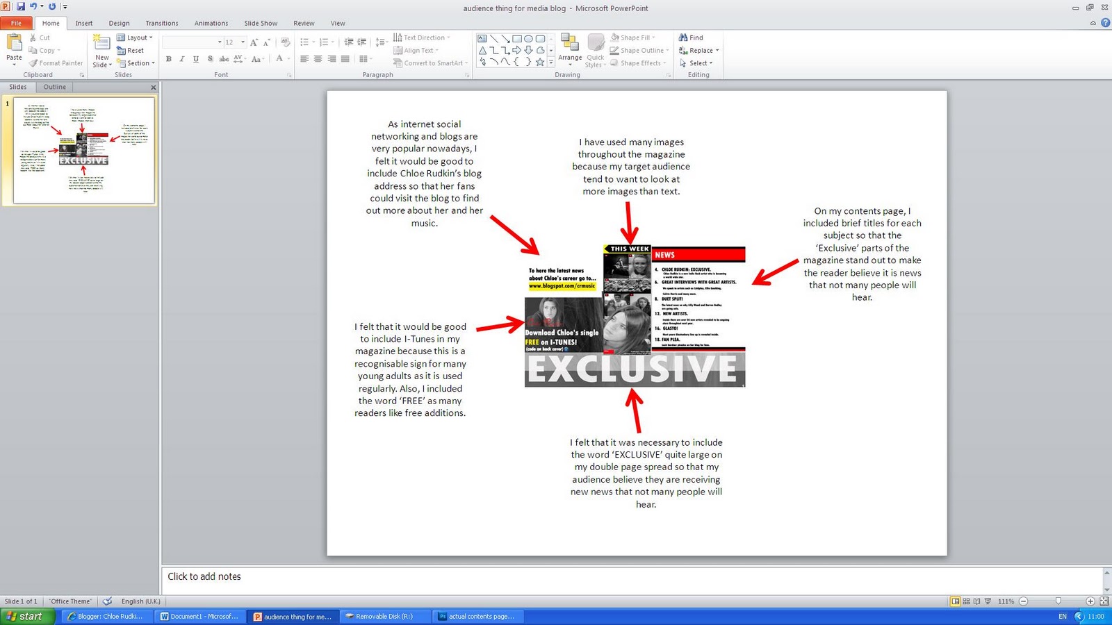
Evaluation: How did you attract/address your audience?
I have created a Power Point slide to demonstrate how I have used different features to match what my target audience like. I have print screened some elements of the magazine and put them together on the page:
Would my target audience buy my magazine?
Interview with Rachel...
Me: Hi Rachel, would you ever consider buying my music magazine?
Rachel: Hello, yes of course I would, the genre really appeals to me and it seems to be great value for money! I also really like the layout too.
Class feedback
I asked many people in my class who are 16 to 17 years old. Most people agreed that they would purchase my music magazine because they liked the design. Others who disagreed said it was because they never purchase music magazines.
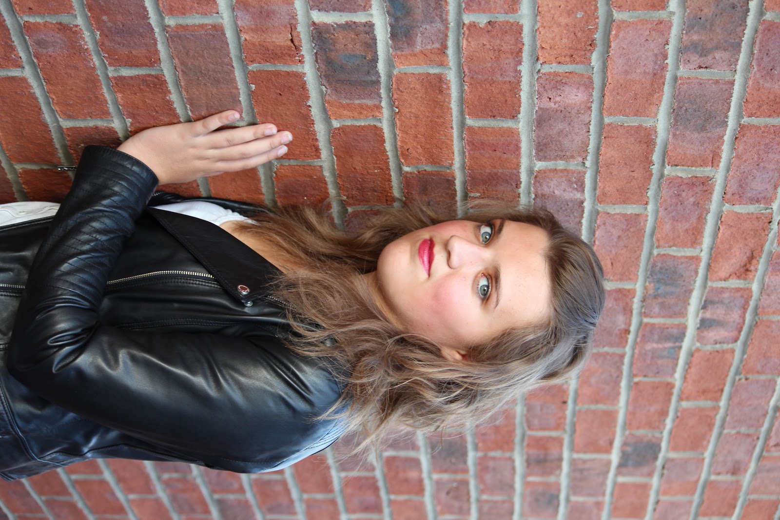
Evaluation question 4: Who would be the audience for your magazine?
As many young adults focus on the stories that appear in the magazine media, I felt that it was necessary to aim my magazine at an audience of 16 to 30 year olds, both male and female but prodominantly female because they focus more on how they look as well as aspiring to be like certain people.

An ideal girl would be Rachel griffin, a 17 year old female who is interested in the latest music. She likes Coldplay and Ellie Goulding who are Indie Rock artists. She is also very natural and has her own style and is not overly confident. I feel that she would by the perfect audience for my music magazine as I want to portray a genuine and natural approach. She spends her free time watching tele and listening to music. She spends her money on new clothes and shoes. She has quite a relaxed lifestyle. Below is an image of Rachel:

Evaluation: What kind of media institution might distribute your media product and why?
The music magazine 'AMP' has a Indie Rock music genre similar to mine. Below is an image of one issue of the 'AMP' magazine.

The publisher for this magazine is the American Music Press based in the United States. This magazine is published monthly and is very popular with their wide range of audiences who are interested in this genre of music.
As technology has developed, websites and apps have been added to the market. This music magazine has a website where people can view all the news that would be covered in the magazine online: http://www.ampmagazine.com/
This would be something that I may consider if my music magazine was popular. This would be a great way for my music magazine to gain publicity which would increse online viewers as well as the amount of magazines sold. However, I feel that it would be more effective to use a publisher in England such as Absolute Publishing Ltd. who are based in the city of London.
Wednesday, 14 December 2011
Evaluation: In what ways does your media product use, develop or challenge forms and conventions of real media products?

Above is a print screen of some frames taken from the parts of my magazine. I have included a range of elements including images and text. I have used these elements to create a bold design throughout the magazine and also to create a professional look. I often added many effects to both images and text eg. black and white effects and drop shadow effects. These ensured a better quality image or more bold text. I created casual looks by minimalistic fashion as well as no props. This meant that the images were simple, but looked effective. The black and white image effects on all of my images created an urban look to the magazine, which related to the Indie Rock music genre. I felt that this was clear in all of my pages. The written content in throughout my magazine was quite minimal, however, on my double page spread, I tried to create a relaxed interview with a chatty approach.
I felt that I have created a unique music magazine for a gap in the Indie Rock market. The magazine looks similar to ones currently on market, however does create a unique layout.
Evaluation: Processes used

Evaluation: My friend's opinions!
I asked my friend the following questions about my music magazine because she fits into my intended audience age range...
Me: Do you like the overall design of my magazine cover, contents and double page spread?
Friend: I really like the bold colour scheme as it stands out to our age group (17+). I also like the range of images used throughout.
Me: What do you think of the layout?
Friend: I think the layout is good as it is clear and easy to read which appeals more to me as a teenager. Also, the magazine includes a range of images which also appeals to us teenagers as we prefer to look at images.
Me: Are there any other comments you have?
Friend: I like how there seems to be lots of interviews included as I like to read about them. Also, I like how there are lots of exclusive parts to the magazine which has better value for money!
Me: Thank you
Monday, 12 December 2011
My Double Page Spread

Inspirational Texts for Double Page Spread

This double page spread really inspired me as I particularly like the full and busy look which makes the pages look more appealing towards the reader. In addition, I like the way in which the main image takes up one half of the page. This makes the subject of the double page spread very clear. Also, I like the way in which the double page spread has a clear colour scheme. I will take some of these points on board when creating my double page spread.


I really like this very bold design used on this double page spread. This design has a similar colour scheme to mine that I will use throughout the magazine. This design focuses more on images as opposed to lots of text which will probably appeal more to my target audience. I will most likely use black and white image colours as this goes better with my colour scheme than coloured images.
Monday, 5 December 2011


Sunday, 30 October 2011
Contents page research. Inspirational texts.

I particularly like this contents page from the music magazine 'Q'. I like the simple design which gives a professional look to the page. All text used on the cover is easy to read which attracts the attention of a reader. Also, I think that the red, black and white colour scheme works well. This colour scheme is also the one I am using on my front cover which I will continue to apply throughout the magazine which will give a professional look. In addition, all parts of the contents page are labelled clearly which makes it easier to read. I will consider these layout techniques when I create my contents page.

This contents page stood out to me because I felt that the layout was very clear and I liked the way that the images had numbers to indicate what page that particular artist/artists will be on. I may use this technique when creating my contents page. Also, I quite liked the plus sign to give additional information. Furthermore, I like the way in which the date is in quite large text behind the word 'contents'. I feel this is a good idea because the reader then knows when the next magazine will be on sale. The word 'Drummer' is in large text which suggests that this is the main focus of this magazine issue.

This contents page is quite different to the other two above as it has a very busy layout. This suggests to the reader that the magazine has many things included and draws in their attention. I like the way in which there is an advertisement at the bottom of the page, this adds more effect and includes the reader more. All sub-headings are bold which makes the contents page clear to understand.
Wednesday, 26 October 2011
Changes to my front cover
I asked for student reviews on my first draft of my front cover. It seemed that many people thought that the main image on the front cover was too dark and that the cover possibly needed more colour. I then took these comments on board to then produce a more successful front cover that would stand out more. I then edited the cover by making the image bigger and not as dark. I changed the layout and added more detail to the sell lines by including who the interviews were with and where the festivals would be taking place. In addition, I added a hint of yellow to highlight important information such as 'NEW' or 'PLUS'. Also, I added some rectangular shapes to highlight the masthead and the sell lines. However, I felt that the black background on the rectangles was too bold, so I decided to change the opacity so that some of the background could be shown through the rectangle.

Thursday, 20 October 2011
Additional Images. Possible ones to include on double page spread (contents)


Effects
As I wanted my magazine to stand out as much as possible, I felt that it was appropriate to use a range of effects. For example, I used the 'Inner Shadow' and 'stroke'techniques to make the text on the magazine stand out better. Also, I used a different style on the 'PLUS' and 'EXCLUSIVE' text which was called 'double ring glow'. This made the text stand out more on the black and white image.
When I first began the front cover, I used different effects on the main image too. Out of all of the image effects, Ifound that the black and white effect worked best as it created a blended look which worked well with the contrasting colours used on the text. Again, this gave a more bolder effect which I felt would stand out to the audience more.
When I first began the front cover, I used different effects on the main image too. Out of all of the image effects, Ifound that the black and white effect worked best as it created a blended look which worked well with the contrasting colours used on the text. Again, this gave a more bolder effect which I felt would stand out to the audience more.
Changing colour scheme

Colour Trials on my front cover.

When I was creating my front cover for my music magazine, I experimented with colours. When I designed my front cover on my flat plan, I used the main colour scheme of green, hoping it would stand out on the image. However, I soon realised that the sell lines at the left hand side of the screen did not stand out well enough to attract my audience.
Additional Research

Friday, 7 October 2011
Preliminary Task


The print screens above show the preliminary task magazine front cover and contents page that I have created. The task was to create a new college magazine for students so I decided to include sell lines that would be appropriate for that audience.
Name ideas for my music magazine

Questionnaire for students to fill in
Questionnaire
Do you buy magazines? (Circle one) YES NO
What price are you willing to pay for a magazine? …………………………………
What music genre do you like? ……………………………………………………………….
What is your favourite colour? ……………………………………………………………….
What features of a magazine do you like (e.g. free items etc.)? ………………………………………………………………………………………………………………..
Are there any other specific things you look for in a music magazine? (If yes list below) ………………………………………………………………………………………………………………...
Audience Research-Music Magazine Assumption Questions
Audience Research- Music Magazine
By Chloe Rudkin


When I look at this particular music magazine, I assume that its target audience are both males and females aged around 16 to 30 by the way it claims to have factual up to date information about recent artists that all teenagers would like to know. After studying the magazine, I can assume the following questions: What breakfast cereal do they eat? I think that the reader for this magazine would probably eat cereals such as ‘Shreddies’. What car/mode of transport do they use? Personally, I think that this reader would drive quite a reasonably priced car in a bold colour. What accommodation do they live in? I think this reader would probably live in their own flat or in student accommodation. What do they drink? This reader would probably drink soft drinks such as ‘Coke’ or ‘Fanta’. What TV shows do they watch? I would assume that this audience would watch TV music channels, or reality programmes. What Music do they like? I think this audience would like current chart music. What is their favourite meal? I think their favourite meal would probably be pizza. What sport do they watch and what sport do they play? I would assume that this reader would watch football or athletics and possibly participate in these sports too. Who is their partner, or are they single? I would assume that their partner would be someone with similar interests and good looking. Where do they go on holiday? I think this reader would probably go on holiday to somewhere cheap like Spain. Do they vote, and if so who for? I think this type of audience would vote for the conservatives. What type of bar/pub/club do they go to? I think they would go to a very busy pub which has a good atmosphere and lots of entertainment. What style of clothing do they wear? I would assume that they would wear all of the latest fashions, or create their own fashions.
Overall, I feel that these magazines have researched their intended reader well by aiming all aspects of the magazine towards them.
Friday, 30 September 2011


Tuesday, 27 September 2011
Brief Magazine Analysis
I have picked the 'NME' music magazine (with the image of a male holding a dog on the cover) to analyse.
I feel that the target audience for this music magazine are both males and females aged around 16 to 30. I think this because the design is quite modern which suggests that all of the music related information is 'now' and up to date. Also, the cover includes a sell line 'The state of music today' which gives examples of all current music. The orange colour on the cover also suggests that it is a unisex magazine because males are associated with the colour blue, and females with red, however, orange could draw attention to both males and females.
Personally, I think that the text is trying to sell an up to date music journal for young adults making them feel that they are listening or gossiping about the latest music hits or albums etc. This will draw in attention from young audiences as music is a craze which every teenager inspires to have the best knowledge about.
I feel that the magazine is trying to set a 'laid back' tone with a great sense of normality. I think this because the image of a male holding his dog is quite informal and gives a 'cool' look which maybe the aim of the magazine as young adults like to be 'cool' and stand out from the crowd.
In terms of ideology, the main image on the cover of the magazine implies that the male is genuine by his stance and facial expression, and also the normality of holding a dog. This may indicate that the information that is placed in the magazine is also genuine.
Monday, 26 September 2011
My Coursework
This blog that I have created will be used to publish my coursework.
The coursework brief I have chosen is the Music Magazine. I will focus on popular music such as pop, or possilbly indie rock. I feel that these genres are popular and will sell more to teenage audiences (my target audience).
I was inspired by the bold 'NME' magazine design as the use of three colours stands out to the reader when standing on a shelf. On the other hand, I would like to create a unique magazine cover which will stand out from any others currently on sale. I would also like to create a magazine which can be continually published into a weekly magazine including all of the latest music from my focused genre. I will include catchy sell lines which will appeal to my audience and increase the amount of sales. Overall, I would just like to create a unique magazine which will stand out.
Subscribe to:
Comments (Atom)